Modernizing Marketing Navigation
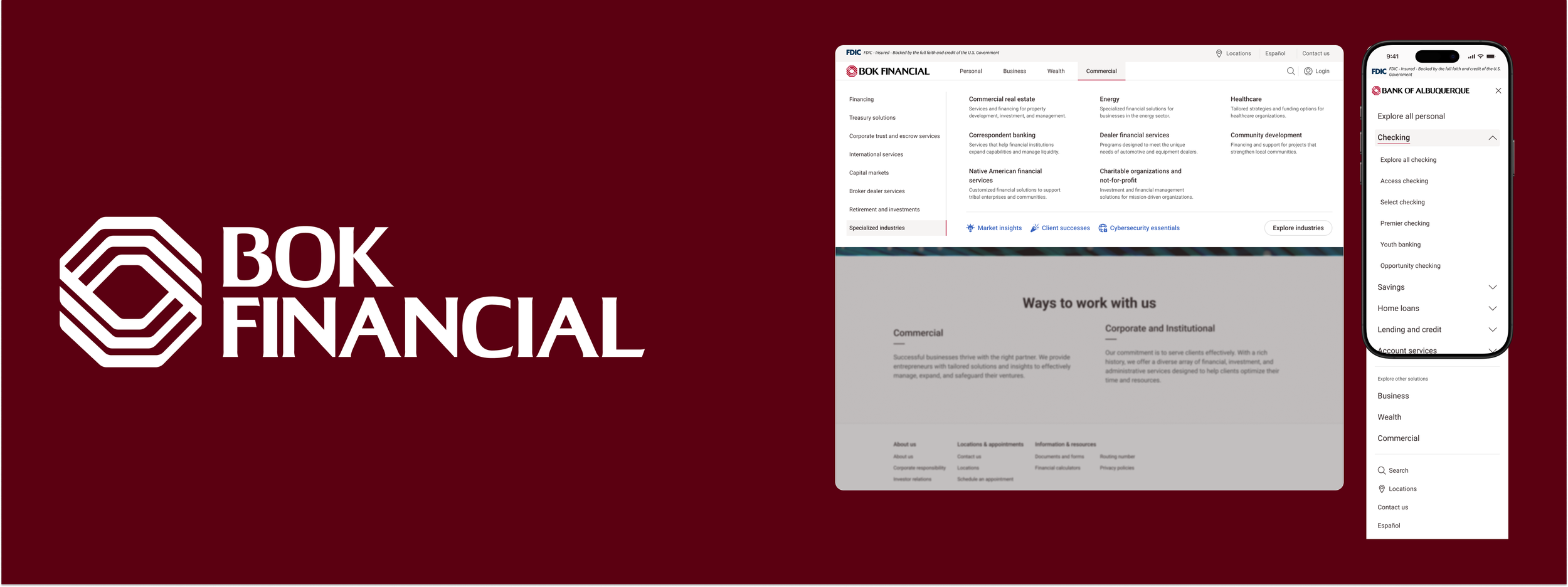
Modernize BOK Financial marketing navigation by shifting away from the left-hand drawer to a horizontal overlay that improves usability and reduces friction across key user journeys.
Role: Lead UX/UI Designer
Timeline: December 2025 - March 2026
Platform: Web / XM Cloud
Impact
Reduce user friction
Decreased time to first meaningful click by 23.2% and improved task success rates across key journeys. Reduced navigation dead ends and backtracking, enabling faster paths to high-intent pages like product and pricing.
Improved engagement metrics
Increased navigation click-through rates by ~13% and pages per session by ~11%, with deeper interaction across key marketing pages. Reduced bounce rate and improved navigation-assisted conversions.
Reduced development time
Cut navigation-related design–engineering conflicts and reduced implementation time by 20.7%. Delivered a scalable system that accelerates future updates and lowers ongoing maintenance costs.
Previous desktop
Difficult for users to focus on page content.
Fails to form an association with the top navigation.
Added complexity to responsive designs with left hand navigation competing with body page content.
Updated desktop
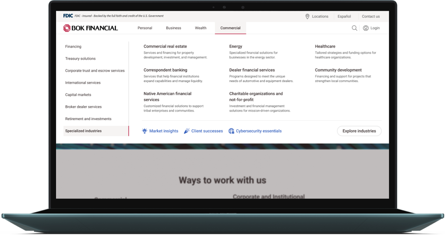
Focuses content on either navigation or page content reducing cognitive load.
Clear insight into information architecture and page hierarchy.
Cleaner look and feel
Usability testing
Design iteration
Discovery
Process
|
Process
Prototype
Final design
Discovery
|
Design iteration
|
Prototype
|
Usability testing
|
Final design
Duration: Three months
Project Manger: Rachel Duncan
Product Owner: Christy Ary
Lead UI/UX Designer: Anna Nuggehalli
Supporting Designer: Alyx Chapman
Discovery & Research
Heuristic evaluation
Using Nielsen’s heuristics, Shneiderman’s rules, and WCAG guidelines, we identified three core usability issues: dual‑navigation complexity, inconsistent labeling hierarchy, and elevated cognitive load.
Competitive Analysis
Analyzed direct competitors as well as “best of” navigation experiences focusing on relationship between child-parent links and interaction standards.
4 national banks
3 e-commerce platforms
Usability Testing
Conducted external and internal unmoderated usability testing on proposed design. Validated design direction and guided minor additional design changes.
Previous mobile
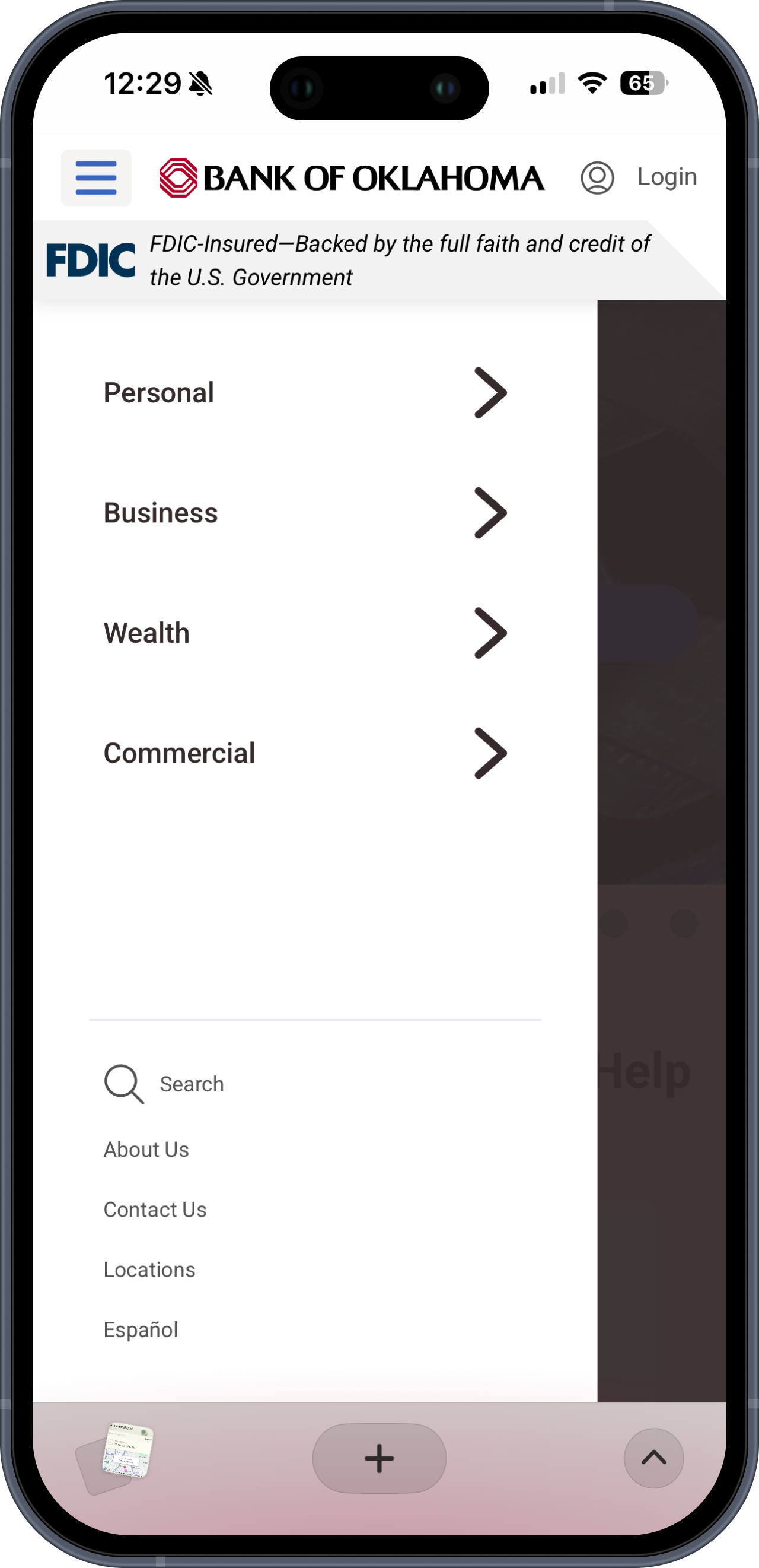
Utility components in static top bar get lost due to grouping.
Menu doesn’t fully utilize screen width making content difficult tor read.
Starts at top level navigation forcing multiple clicks to filter down.
Drill in functionality discourages user exploration.
Updated mobile
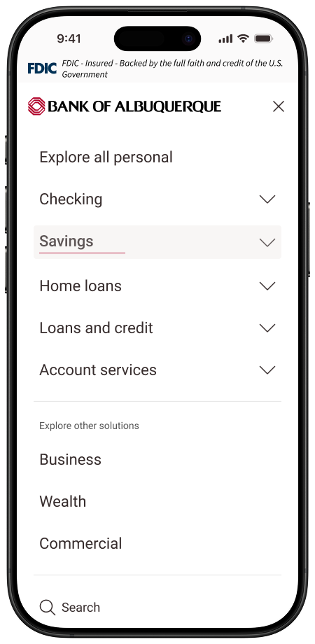
Groups utility icons in dynamic top bar.
Full screen menu with focused view helping to orient user.
Starts at secondary level based on user location decreasing time to filter content.
Expandable sections to encourage user exploration.